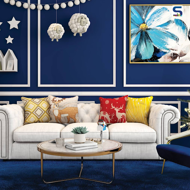
How to Bring the Pantone Colour of the Year in Interiors
When the announcement came in this last month, that the Pantone Color of the Year 2020 is Classic Blue, it was met with surprise and (to be honest) some derision. There was a lot of commentary around how the Classic Blue selection was staid (and ahem! a little boring), especially seen in comparison to Pantone’s 2019 Colour of the Year - Living Coral. But the release was accompanied with this poignant message: “When we look at the world around us, we know that we’re living with a lot of unrest, where some days we don’t feel quite as secure. Blue, from an emotional, psychological standpoint, has always represented a certain amount of calm and dependability. It’s a colour that you can rely on.” Pantone felt that the colour highlighted dependability, trustworthiness, credibility, and constancy, all traits that are valued in the fast-paced, high-stress situations of the current world.
Read more:- https://www.surfacesreporter.com/articles/51421/ways-to-incorporate-the-pantone-colour-of-the-year-in-our-interiors


Comments
Post a Comment